Limited Time SEHS T-Shirts Are Here To Stay
1. Black History Month T-Shirt
The Black History Month T-Shirt is the top t-shirt produced by SEHS so far this year. The design, the message, and the color scheme all work extremely well together. I especially enjoy the simple design of the T-shirt, with the all-black front with the black Saint Edward and Black History Month-inspired messaging. To me, this simple design creates a somber tone to the t-shirt, reflective of the long, hard history that African-Americans in the United States have endured and continue to endure today. As fellow classmate, Brendan Waters said, “I like them because they have a good color scheme, and are fashionable while still conveying a strong message.” On the back is the classic Black History Month design, and this allows the shirt to pop, with the white directly contrasting the deep black of the T-shirt. Not only is the design of the shirt a huge plus, but the simple aesthetic of it also allows for it to be worn on many different occasions. The all-black with the pop of white is a classic. The message combined with the design catapults this shirt to number one on the list.
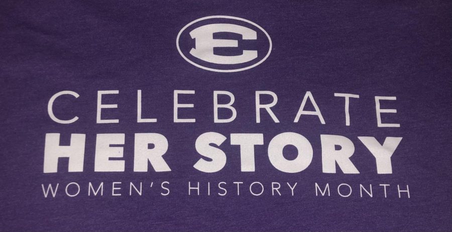
2. Women’s History Month T-Shirt
The Women’s History Month T-Shirt comes in a very close second. Firstly, I loved the way in which the school made a shirt regarding Women’s History Month. After years of being a private, parochial, all-boys institution, Saint Edward is finally becoming more open, and this T-shirt represents the new direction of the school. Aesthetically, I am a huge fan of the purple color the shirt was made with. I really enjoy the theme being on the front of this T-shirt, and this allows the theme of the shirt to still be visible with a flannel over the top. Like with the Black History Month shirt, this is another SEHS shirt I wear on a regular basis. The only complaint I have regarding this shirt is the quote on the back. While it was by no means a bad quote, I do feel as if a better one could have been chosen, especially with the large amount of space available on the back of the shirt. The purple and white combination is visually appealing, and combined with the message, this shirt takes a very close second.
3. Hail the Cross of Our Only Hope T-Shirt
Firstly, I would like to thank Richie Pokrywka ‘21 for designing this shirt, and this shirt could easily be number one. The top three shirts are all so close, and I love the t-shirts we’ve been coming out with this year. The color scheme of this t-shirt is my favorite aspect of it. The pastel green and yellow really set it apart from other SEHS shirts, and I myself am personally biased toward pastels. This pastel lettering was also allowed to pop against a slate grey backdrop, a design choice that really allows the pastels to flourish, rather than overpowering the palette or being drowned out by other bright colors. The anchor behind the wording on the front is also a nice touch, and it does not overpower any other elements of the shirt. I only wish the back was utilized more, perhaps with more hints of the pastels used on the front. All around, this shirt is designed extremely well, and the color scheme is my favorite of any SEHS shirt.
4. Side By Side T-Shirt
By no means do I dislike this year’s theme-based T-shirt, but at the same time, it has the least to offer of the four t-shirts here. The first thing I especially like about this year’s theme and T-shirt is the quote that goes along with it. The theme of standing side by side with those around the world who are battling similar issues resonated with me, especially in this specific moment in time within the Ed’s community. I also like the kelly green hue which takes up the main body of the shirt, and the yellow accents go nicely with the green. To me, the coloring is reminiscent of the Oakland Athletics Kelly Green Alternates, which are my favorite MLB jerseys. However, the design and layout of the shirt itself was clunky, and the large blocky letters with the lines above and below it were bland. Also, the darker shade of green used on top of the kelly green did not allow the side by side to pop as much as it should have. To me, if a more contrasting color was used, the theme for the year would pop out more and would therefore be more appealing. Overall, this shirt was solid though, but it could be made better if it was structured with more creativity.
Going forward, I would enjoy the release of more SEHS themed shirts. I have greatly enjoyed those released within the last few months, and classmates who I have surveyed indicated a similar desire. In the coming months and next year, I hope that more shirts are released, especially those relating to a specific theme, such as Women’s History Month. Also, I think it would be even better if these designs were not limited to t-shirts, but expanded into other articles of clothing, such as sweatshirts and long-sleeved t-shirts.